Improving usability and accessibility for a public agency
At a glance
Understanding the challenges
The agency's products serve a wide and demanding audience: HR teams, researchers, risk-prevention specialists and policy makers on one side — and on the other, workers and companies of every size looking for guidelines and assessment tools. As a product/UX designer in a team of 4, I worked across more than 5 of these products, each with a different purpose but a shared need: improve the user experience based on real data, and raise accessibility across the board.
From low-fidelity prototypes to evidence
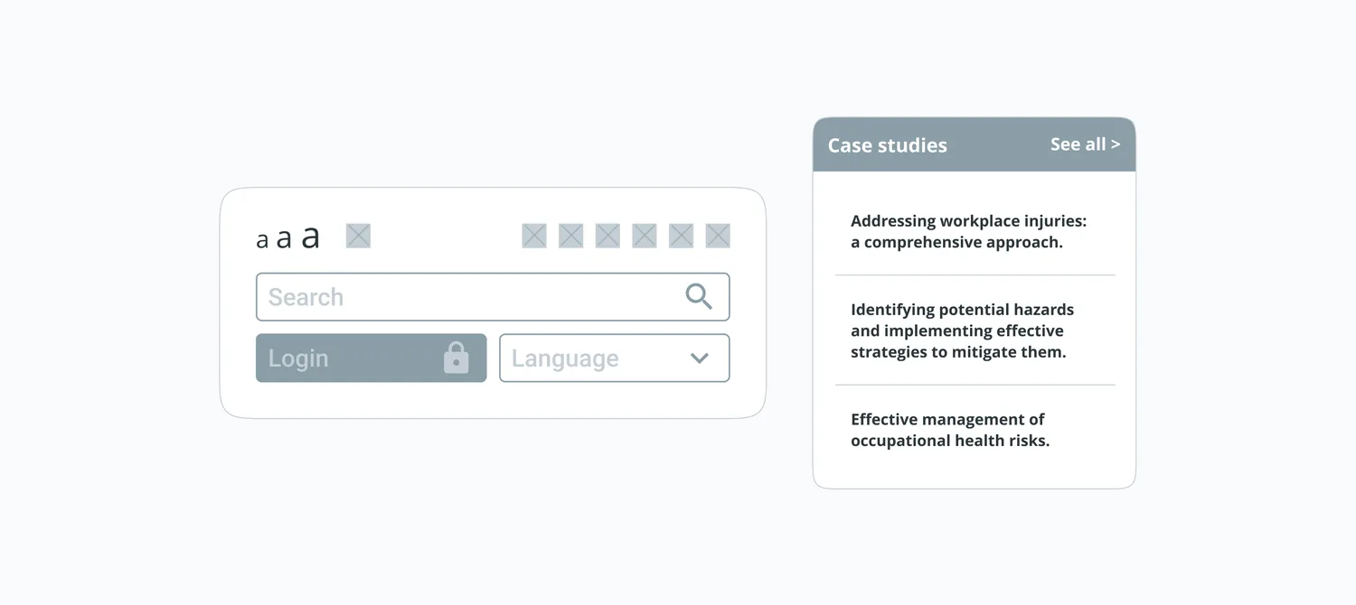
Every improvement started as a low-fidelity prototype — fast to build, cheap to throw away, and detailed enough to test navigation, information architecture and UX patterns before any visual design. Working lo-fi kept the conversations with users and stakeholders about structure and flow, not colors.
Moderated user testing, online and in the office
Each project went through moderated usability testing with around 12 users per round, in sessions of 60–90 minutes — run both remotely and in person at the office. After every round we synthesized the findings into research reports with results, conclusions and recommended solutions, so decisions were grounded in evidence and aligned with both stakeholder expectations and user needs.
Workshops to align and co-create
Alongside testing, we ran design reviews and co-creation workshops with stakeholders — to gather requirements, align expectations early, and decide together which findings to act on. That kept the work moving through a public-sector environment where many voices needed to be heard.
Designing for enhanced experience
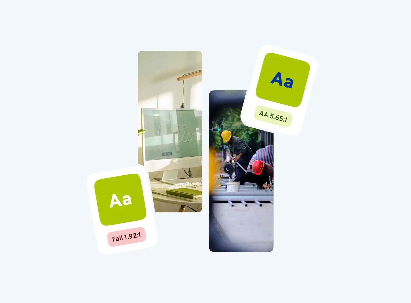
Accessibility wasn't treated as a checklist pass at the end — it shaped the design process from the start. Navigation, contrast, and content hierarchy were reworked to meet WCAG requirements while staying usable for people without any assistive technology at all, since the two goals are rarely in conflict when done properly.
The outcome
More than 5 products improved through the same evidence-driven loop — prototype, test, report, iterate — with clearer information architecture and accessibility built in as a baseline, not an afterthought. For an audience that includes people the product cannot afford to fail, that loop is the deliverable.