A training & engagement platform for healthcare professionals
At a glance
The challenge
Pharmacists and doctors use the platform to keep up with the company's field: new papers, update trainings, upcoming events, product guidelines, and resources they can download to share with patients — plus notifications tying it all together. The hard part was exactly that breadth: making one easy, intuitive platform hold many very different types of resources without turning into a maze.
My role
I worked across product design and the design system, in a team of 2 designers and 1 PM with a team of developers — in close collaboration with the client's business and technical stakeholders. Owning both the flows and the component library meant every new screen was a chance to either reuse or refine the system rather than drift from it, and stakeholder alignment was part of the design work, not an afterthought.
The approach
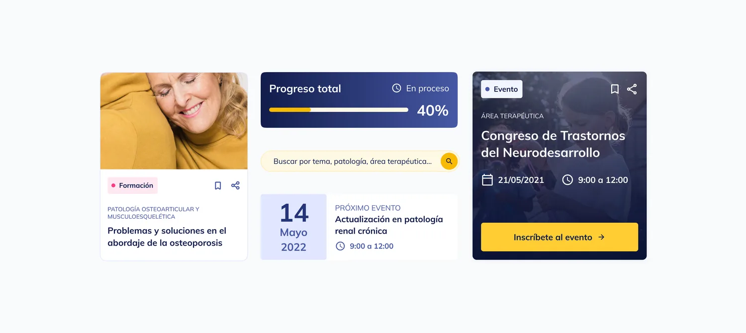
The answer to the content breadth was structure: a clear information architecture that gives trainings, papers, news, events and patient resources each an obvious home, served by a deliberately small, composable component set. One visual language across every content type — so a doctor moving from a course to a paper to an event registration never has to relearn the interface.
The outcome
A single, coherent platform that keeps healthcare professionals engaged with the company's products and up to date in their practice — where the design system carries many content types through one interface users only have to learn once.